Worldwide Suicide Rates
with Python & Tableau
Project Background
Death by suicide is a highly complex issue that causes pain to hundreds of thousands of people worldwide every year. The World Health Organization (WHO) and the Global Burden of Disease study estimate that almost 800,000 people die from suicide yearly. The following scripts of a data analysis aims to identify the vulnerable groups to improve suicide prevention.
Objective
This analysis aims to find signals correlated to increased suicide rates among different cohorts globally, across different indicator variables.
Question
What are relevant variables that correlate with a high suicide rate?
Skills
- exploratory visual analysis
- wrangle, clean, and merge data files
- geospatial analysis
- regression analysis
- cluster analysis
Tools
- Python
- Tableau
Suicde Rates per Country

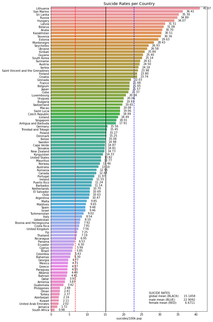
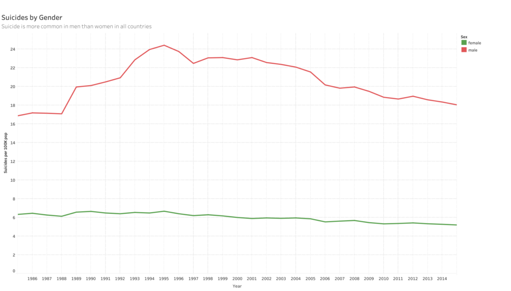
Looking at the map and the following chart we have a good overview of the suicide distribution. It is obvious from the bar chart that men commit suicide significantly more often than women. Hence, gender seems to be a relevant factor in suicide prevention.
Factor 1: Gender
Factor 2: Age & Generation
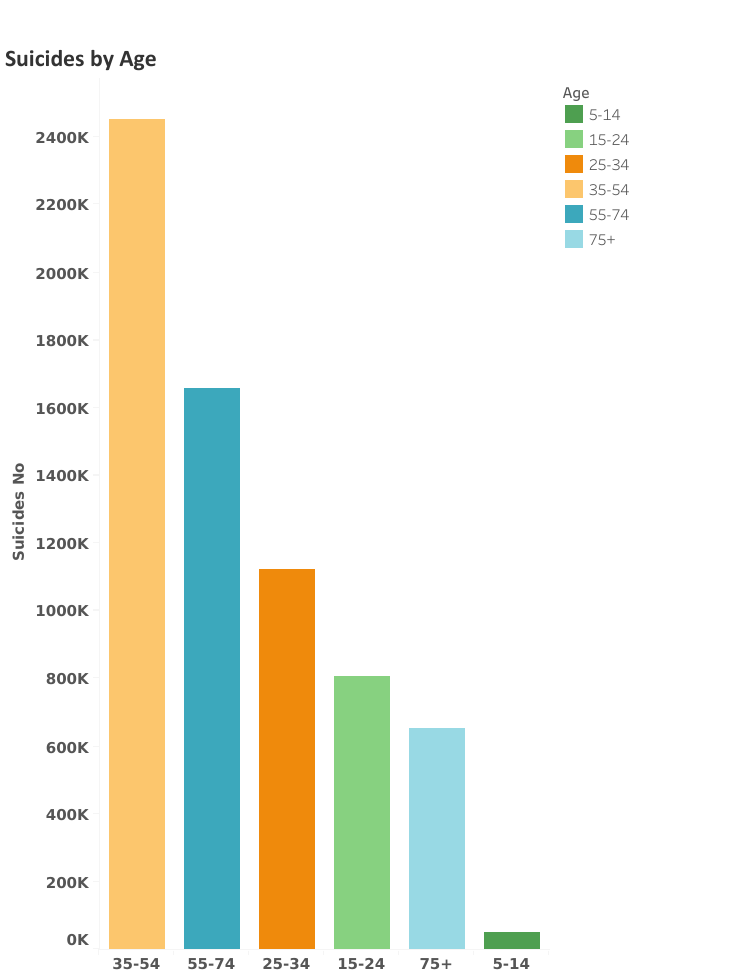
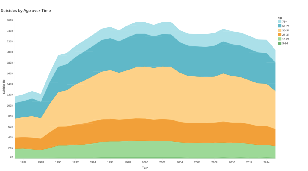
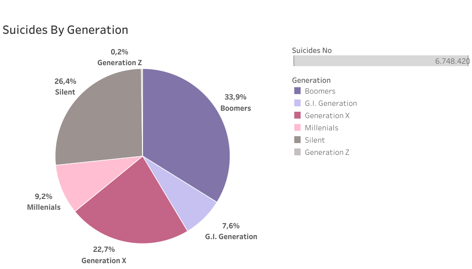
Age is another factor to analyze to improve suicide prevention. Looking at the following charts it is clear, that people in the age group 35-54 is most vulnerable, followed by the age group 55-74. Looking at different generations, we can see that the Boomer Generation (born between 1945-1964) makes roughly 1/3 of the suicides.
Conclusions
The analysis showed correlations between the factors age, generation, gender and suicide rates. Most evident is the correlation between gender and suicide rate. Men are way more prone to suicide than women. Also, it turns out that the Boomer generation, people between 35 to 74, are most vulnerable when we talk about suicide. This information helps to build better prevention programs. It is also a good sign that the suicide rate dropped over the last few years.
Note: The data set is limited to only 38% of the population and contains less than half of the world’s countries. It is biased towards the European population.
Links
See more visualizations in the according Tableau Dashboards.
